

5 UX/UI Rules for Boosting Conversions
The modern AI product market is growing every day and becoming highly competitive, where ease of use and interface quality play a crucial role in attracting and retaining users. Implementing effective UX/UI solutions not only increases customer loyalty but also contributes to higher product monetization.
Based on our experience working with over 30 AI startups, we have identified the most common mistakes and developed practical recommendations for addressing them.
1. Simplified User Registration 🏃♂️
The registration process is the first interaction with the product and should be as simple and convenient as possible.
❌ Common Mistakes:
- Requesting an excessive amount of data before granting access to features (full name, company, position, etc.)
- Mandatory email confirmation before entering the product
- Re-entering the password
- Complex password requirements without an offered generator
✅ Effective Solutions:
- Additional login through Google, Apple ID, or social networks
- Minimal number of required fields (email, password)
- Splitting registration into stages: initial contact information entry followed by personalization
- The option to test the product in guest mode without registration
- Logging in via email with a temporary code instead of a password
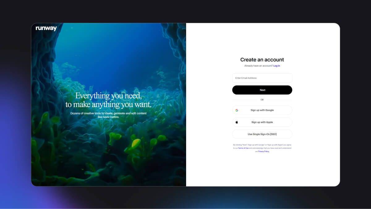
Runaway — a good example of a login with minimal fields and the option to register through external services
2. Thoughtful Onboarding 🤝
AI products often have complex functionalities, so it is important to provide users with an understandable learning process without overwhelming them with information.
❌ Common Mistakes:
- Lengthy training modules without an option to skip
- Excessive text instructions without visual support
- Complex explanations that require additional clarification
✅ Effective Solutions:
- Brief step-by-step prompts that enable rapid familiarization
- Interactive training allowing users to learn functionalities as they work
- The ability to skip onboarding or repeat it at any time
- Contextual tips that appear when a feature becomes relevant to the user
- Personalized onboarding tailored to the user's specific tasks
- Onboarding progress indication (e.g., “Step 2 of 5”) so the user understands its duration
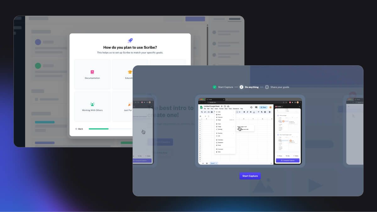
Scribe — a good example of personalized onboarding and animated product demonstrations
3. Intuitive Navigation 🧭
Users should be able to easily navigate the product and quickly find the necessary functions.
❌ Common Mistakes:
- A confusing menu structure
- Lack of visual indicators for the active section
- Duplicating functionality in different places without a unified logic
✅ Effective Solutions:
- Placing navigation elements in familiar zones (in SaaS products — on the left; in mobile apps — at the bottom)
- Clear icons and understandable section names
- Using submenus in complex, multi-layered interfaces
- Optimizing the mobile version of navigation
- Logical connectivity across all sections, ensuring any page is accessible within one or two clicks
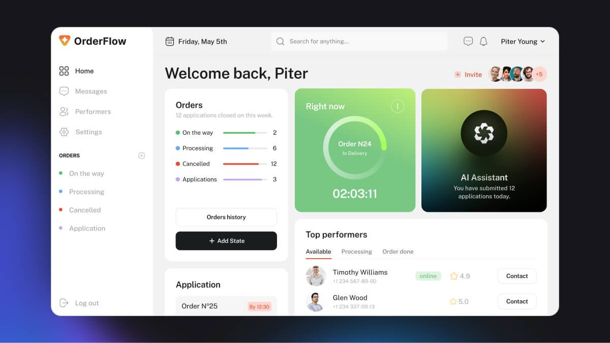
OrderFlow — an example of user-friendly navigation divided between a primary sidebar and a secondary header on the website
4. Minimizing Clicks to the Target Action ⚡
The fewer actions required to complete a key task, the higher the conversion rate and user satisfaction.
❌ Common Mistakes:
- An excessive number of steps for subscribing or making a purchase
- Requesting unnecessary data
- Multiple ways to perform the same function without consistency in UX
- Important buttons hidden in deep menus
- An excessive number of pop-up windows
✅ Effective Solutions:
- Minimizing the number of screens and steps without compromising convenience
- Placing key CTA buttons in the most accessible areas
- Requesting only the necessary data, without extra fields
- Implementing auto-fill and smart prediction of user data
- Consistent UX patterns to ensure intuitive interaction with the product
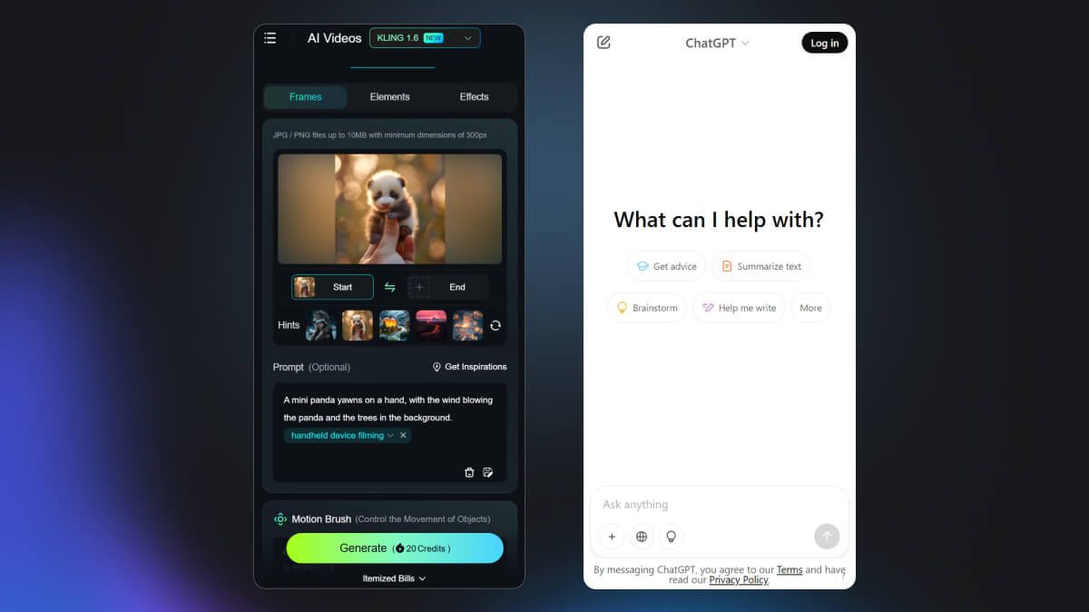
Kling AI and ChatGPT— examples of quick interaction with the product's main feature, where users can select from preset options for what they want to generate
5. Effective Monetization 💰
Users must clearly understand the product's value before payment, and the paywall should nudge them towards making a purchase.
❌ Common Mistakes:
- Demanding payment without demonstrating value
- Long and abstract tariff descriptions without concrete benefits
- Lack of use cases or comparative data
- A strict paywall immediately after registration
- A complex and confusing pricing system
✅ Effective Solutions:
- Access to basic features in the free version
- Clear and concise explanation of the advantages of each pricing plan
- Offering a trial period
- Visually highlighting the most optimal pricing plan
- A contrasting and noticeable subscription button
- Using time-limited offers
- Displaying costs in a unified format for better price perception (if tariffs are given per year and per month, convert costs to a monthly sum)
- Regular analysis of user behavior to adapt pricing offers
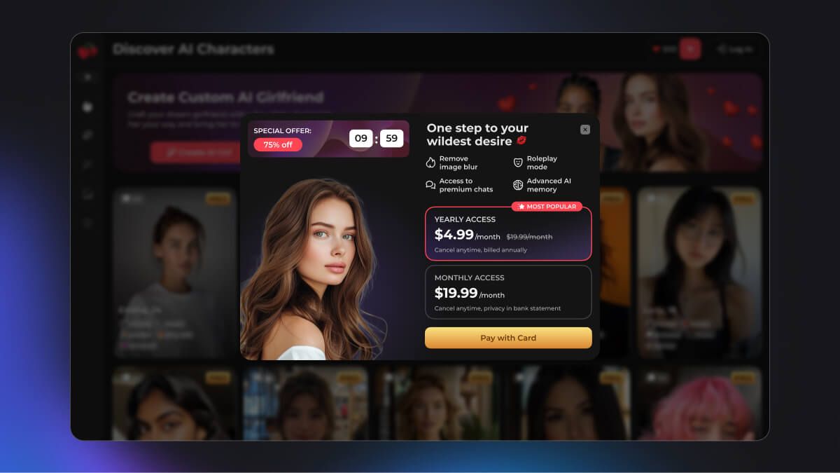
Cherry.AI — in this product, we increased purchase conversion by 18% by adding a timer, prominently highlighting the main pricing plan, and incorporating an image of a woman on the paywall
Conclusion 🎯
Implementing these UX/UI principles will not only enhance the ease of use of your product but also significantly improve key business metrics.
Other articles

UX audit of the landing page and online veterinary consultation service TextTeo
UX audit of the landing page and online veterinary consultation service TextTeo
How We Created a Hamster Kombat Clicker-Style Game with 700,000 Users
How We Created a Hamster Kombat Clicker-Style Game with 700,000 Users
