

UX audit of the landing page and online veterinary consultation service TextTeo

TextTeo is an online platform that offers pet owners 24/7 consultations with verified veterinarians via chat or video calls. Users can choose the right specialist, book a convenient consultation time, and receive personalized treatment recommendations. TextTeo also provides access to pets' medical history and offers ongoing support for current treatments and disease prevention.
Goals of the Audit:
- Identify possible reasons for low registration conversion
- Determine why a high percentage of users leave the platform quickly
- Uncover interface issues and growth opportunities within the product itself
How We Structured the Process:
- Conducted desk research: performed a detailed analysis of industry leaders (reviewed key statistical indicators, noting strengths and weaknesses that may affect performance), and explored best practices from industry experts such as CXL, Unbounce, Hubspot, and Toptal.
Best Practices for Improving Conversion Rate
How to Increase Conversion Rates: 26 Effective Tips and Strategies
User Experience Audit: Sample Report
A detailed breakdown of the strengths and weaknesses of market leaders
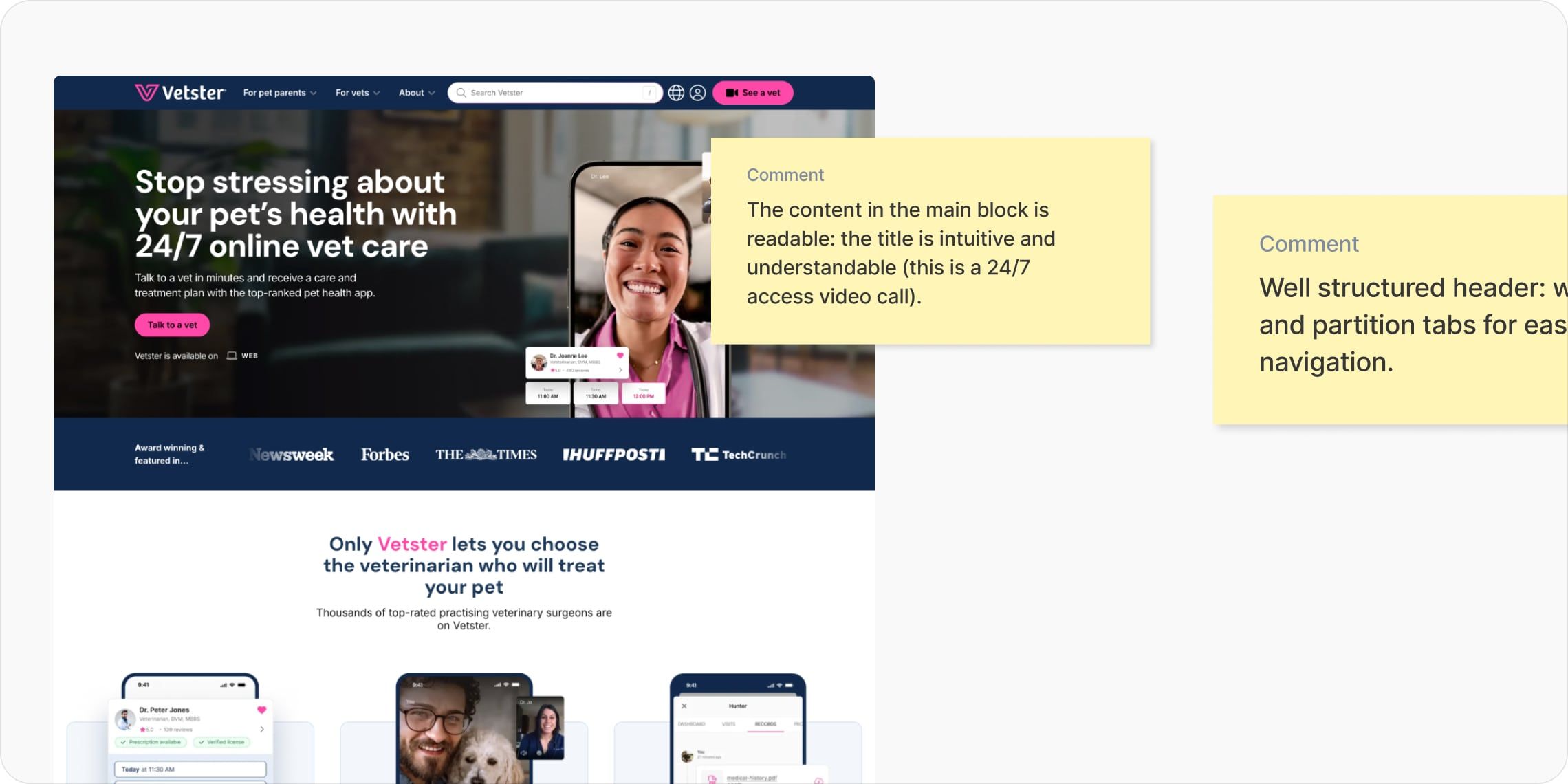
2. Conducted a block-by-block UX audit of the homepage, taking into account analytical data.
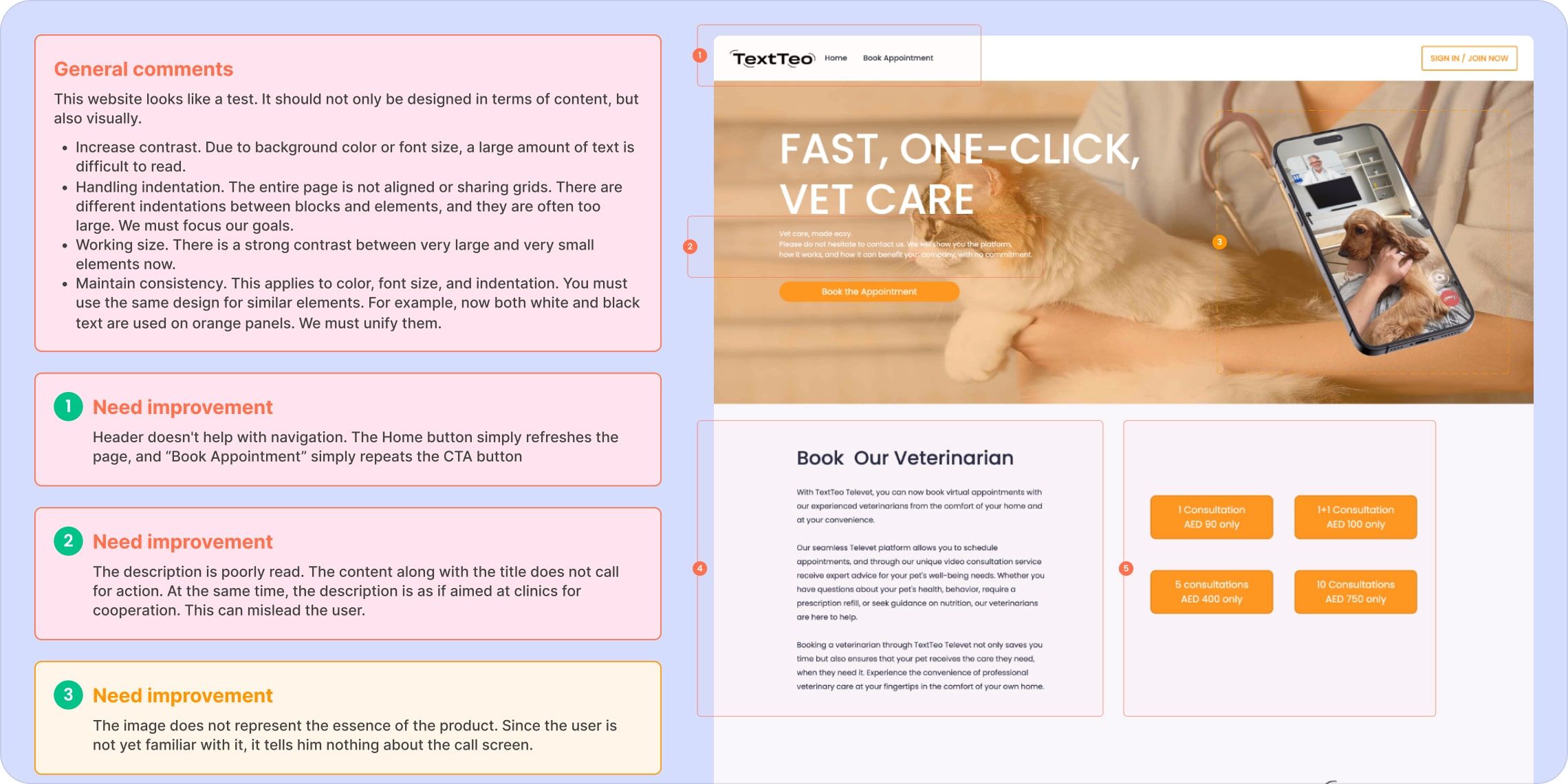
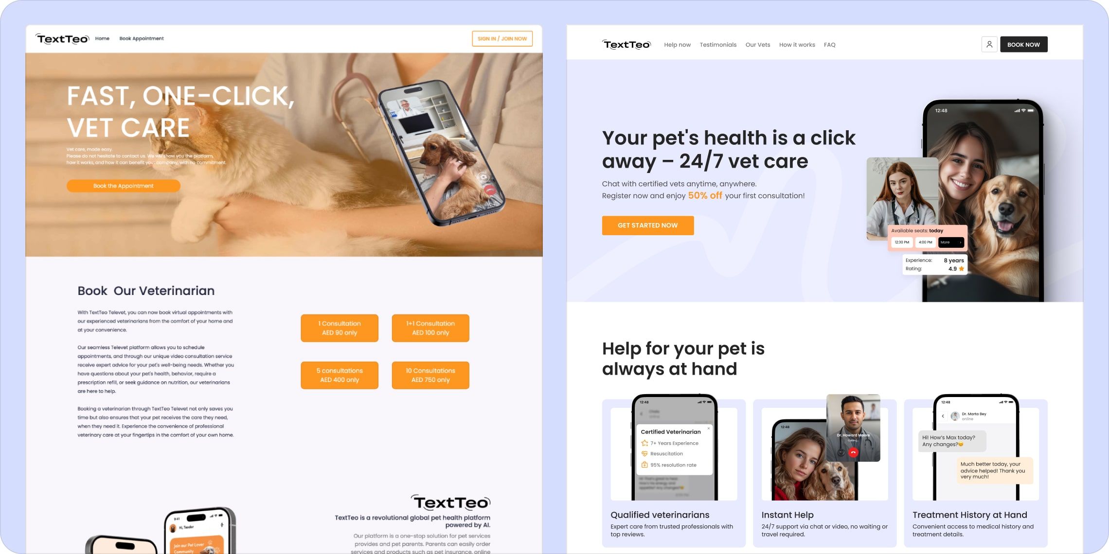
Landing page audit
3. We identified the main user journeys and conducted a UX audit to analyze how users interact with the product in its current state, uncovering pain points and opportunities for improvement.
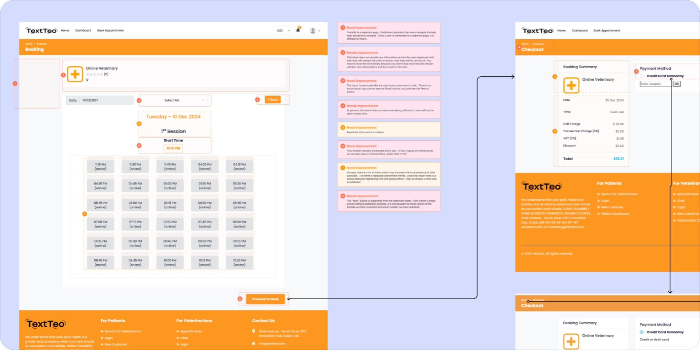
User journey audit
4. We conducted a brief survey to gather insights from potential users.
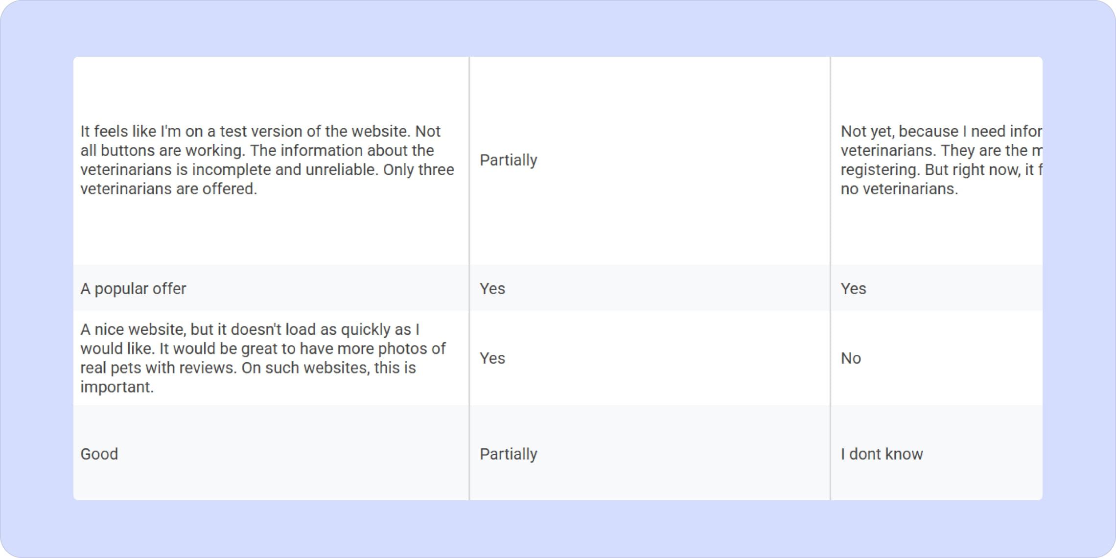
Some user responses about the current interface
5. Formulated hypotheses about potential reasons for customer drop-off.
A comprehensive document with hypotheses — text and images are blurred due to NDA, as they contain product metrics
6. We compiled a list of recommendations to improve the landing page and simplify the registration process, and then created a redesigned version to enhance the overall user experience.
What We Discovered:
Based on analytical data, the user survey, research, and industry best practices, we compiled a list of hypotheses that may explain the low performance. Here are the key ones:
- No incentive to register right now. Users are not ready to register because their pets are currently fine. The website does not offer any additional benefits for registered users — such as discounts, bonuses, or unique features — which may lower motivation.
- Content-related issues. Users lack “trust points” in the product — such as reviews, case studies, information about the veterinarians, details about how the consultation and request process works, product interface previews, answers to frequently asked questions, and possibly even a demo version. This type of content helps build trust in an unfamiliar brand, which is especially important when it comes to our pets' health.
- Design and structure issues on the landing page. The current landing page lacks a clear structure. It doesn't guide the user properly, fails to communicate value clearly, and presents scattered attempts to address user pain points. It's important to refine the copywriting, deliver messages more concisely, and break down large text blocks into digestible sections. More emphasis should be placed on showcasing the vets, the product interface, and what the registration process looks like (this connects directly with Hypothesis 2).
- Trust and data security concerns. Many buttons look clickable but don’t work, navigation is unclear, and there are recurring technical bugs and slow page loads. Users may avoid registering due to concerns over data security and a general lack of trust in the product.
- Irrelevant traffic is being directed to the site. Our research showed that targeting is currently misconfigured, resulting in site visits from users who are not actually interested in the product.
Key Feature of the Process:
The initial request focused on improving the registration process with minimal resources, using existing data and the current design. As part of optimizing the original homepage design, it was also necessary to enhance the user experience to increase the conversion rate.
Due to tight deadlines and specific client priorities, we introduced a prioritization system for implementing changes to the website and registration process.
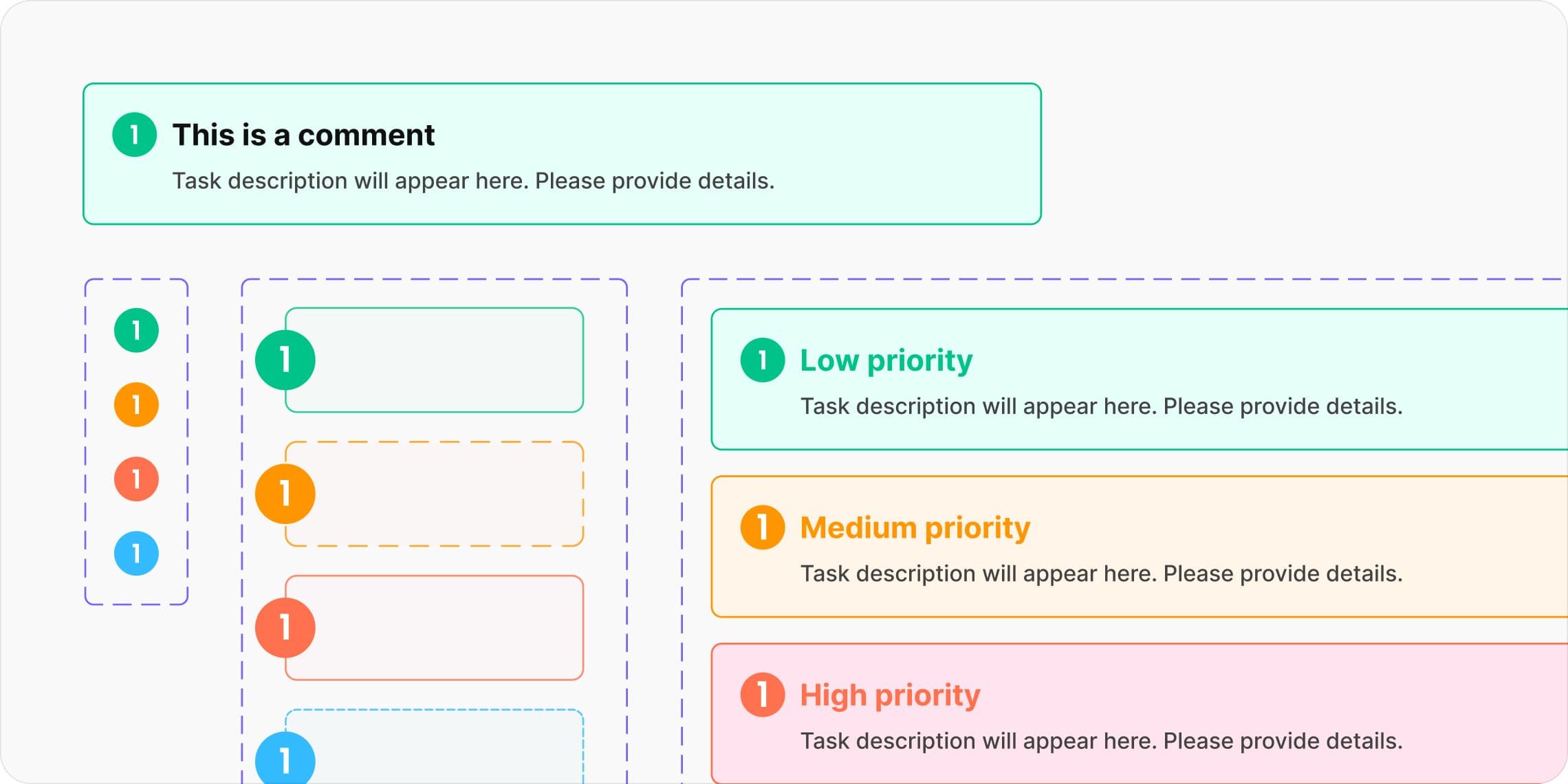
System for prioritizing tasks
Key Recommendations:
To increase motivation to register, it's important to offer clear value — for example, a discount on the first consultation if they sign up now, with the option to use it later. It's also essential to provide convenient, non-intrusive booking options that don’t create pressure.
At the same time, the registration process should be simplified. The form should be less overwhelming, and the overall flow should feel quick and easy. The registration page had not only structural issues but also several bugs we identified.
Previously:
- Too many required fields during registration, significantly reducing conversion.
- No option to register with a single click.
- Incorrectly functioning input masks for form fields.
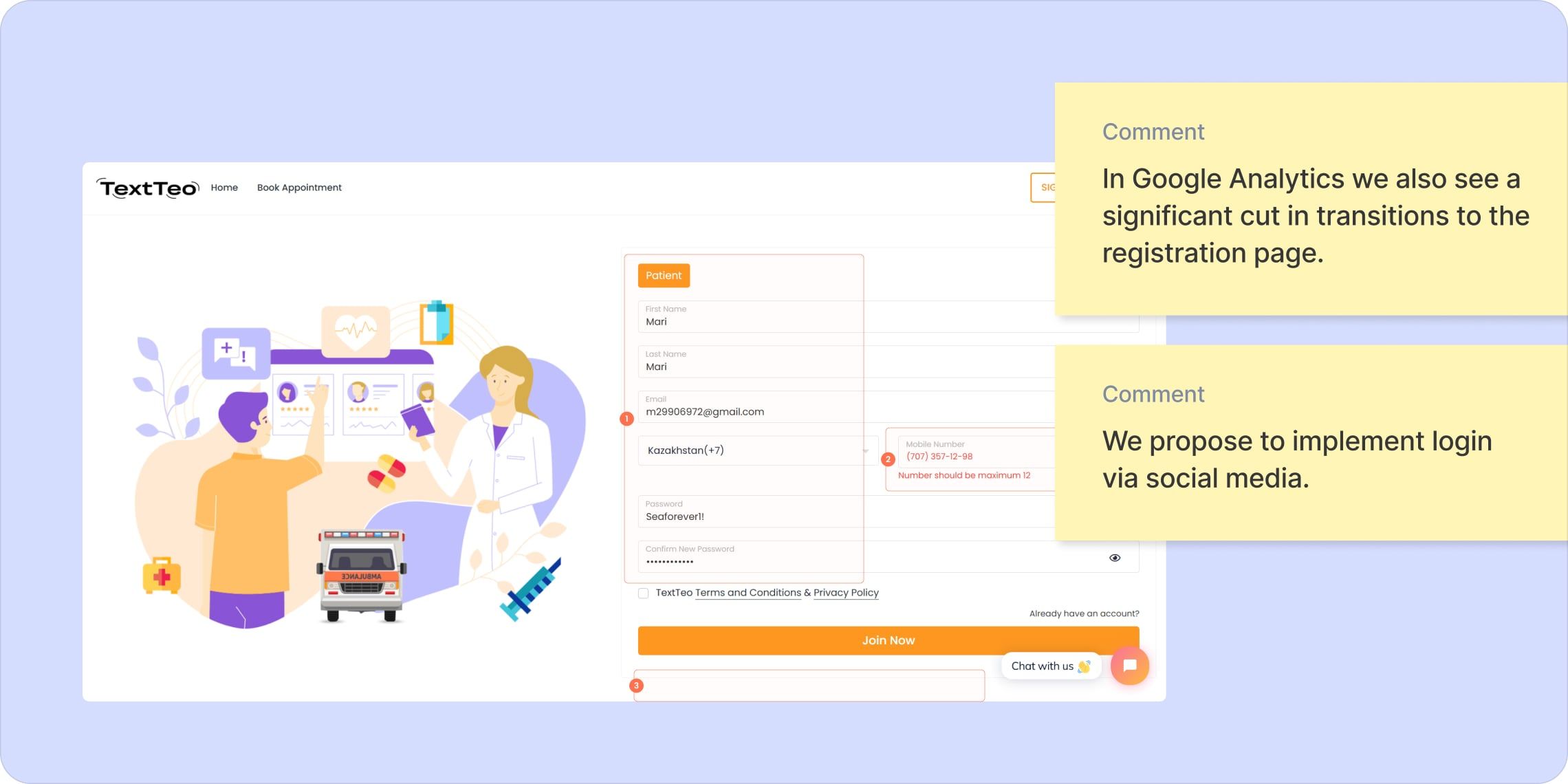
Analysis of the main issues in the existing registration form
Updated:
- Introduced two quick registration options for users to choose from: one-click registration via SMS code and a standard input form.
- Added the option to register quickly via social media or email.
- Reduced the number of input fields to avoid negatively impacting conversion.
- Slightly adjusted the layout of elements to align with familiar UX patterns while staying within the bounds of the existing design.
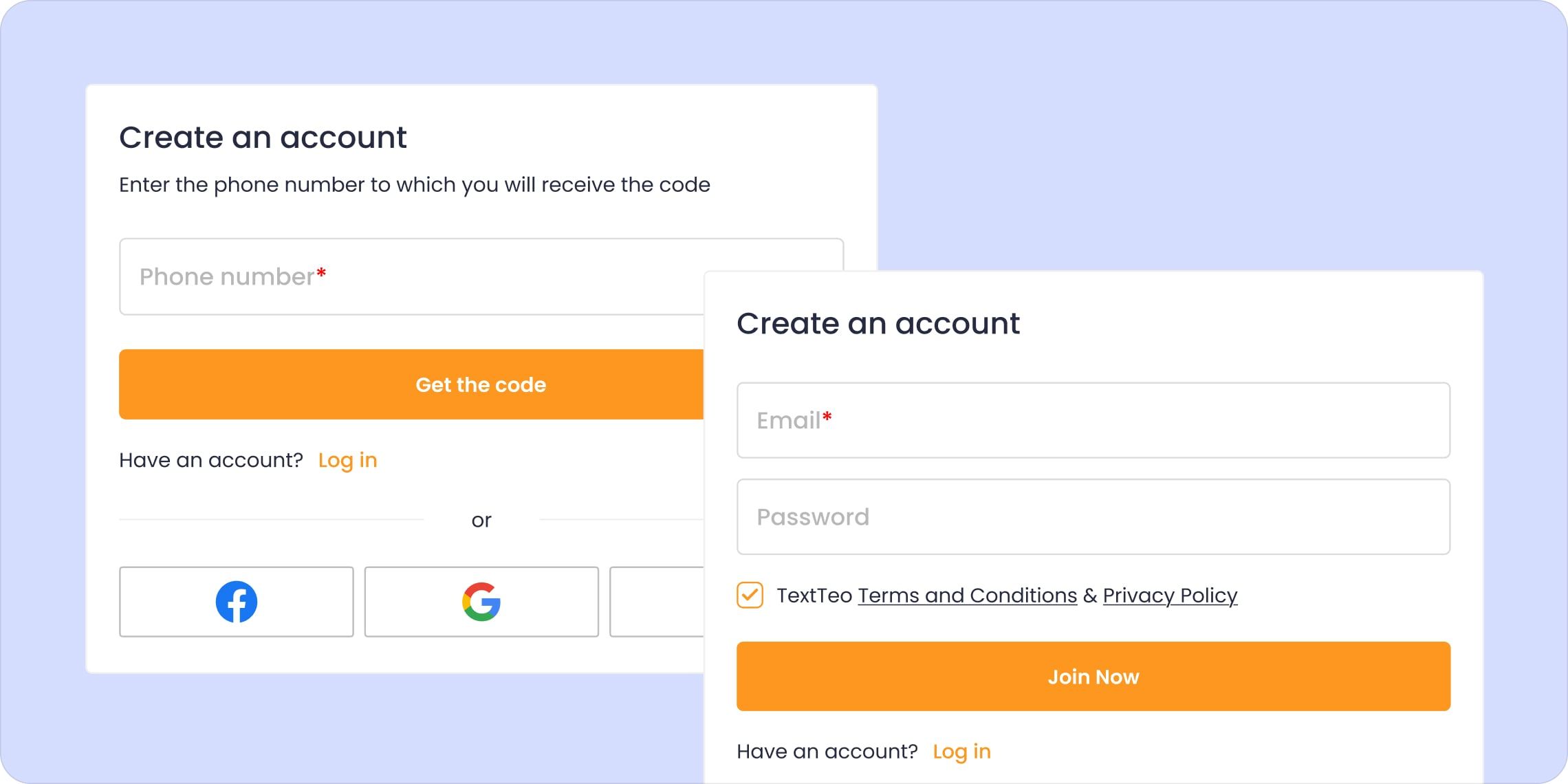
Registration options we provided based on the current UI
2. Refine the content in each section to provide users with all the necessary information and increase trust through social proof. As shown by the survey results and competitor analysis, users place high value on seeing customer reviews. Currently, the homepage lacks social proof elements — aside from the partner logos and social media links placed in the footer.
📌 You can find more details about the landing page redesign in our case study on Behance.
Landing Page: Before / After
3. Implement the AIDA framework, gradually engaging the user and leading them toward registration.
4. Address the list of identified bugs and issues, as they can significantly impact user trust.
5. Focus more on audience segmentation and engagement. For example, by adding a widget to the site that collects user feedback in exchange for a discount or benefit.
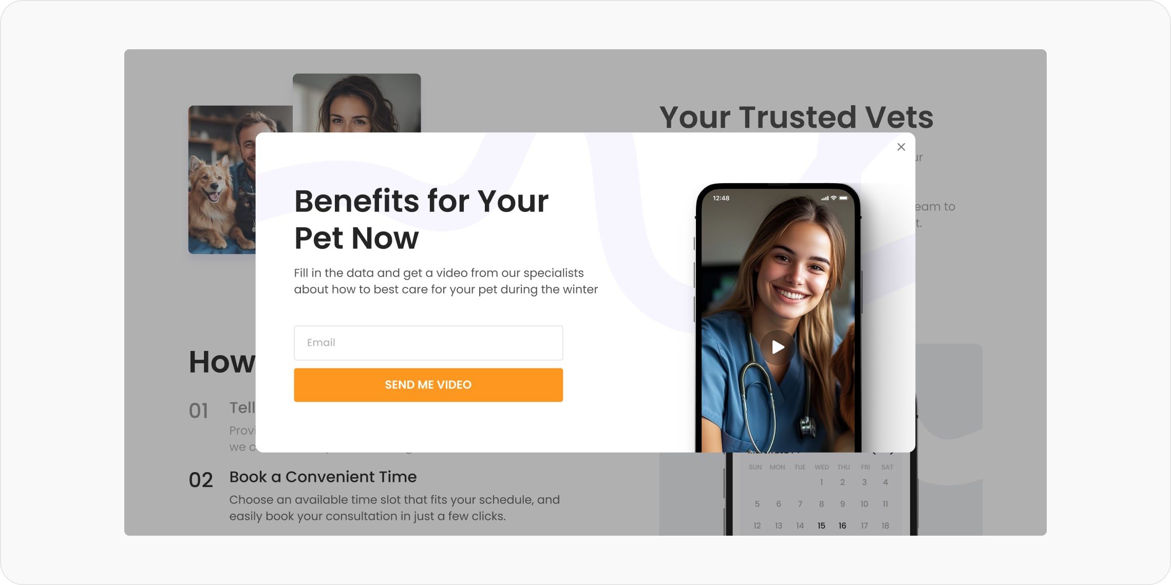
We are testing various offers on the website to capture user contact information for further engagement
We’re currently continuing our work on improving the website’s conversion rates, but we’re already seeing the impact of the changes made. Feel free to share your thoughts on this case!
We’re always happy to help audit and improve the metrics of your product or website. Reach out to us to discuss the details:
Other articles
5 UX/UI Rules for Boosting Conversions
5 UX/UI Rules for Boosting Conversions
How We Created a Hamster Kombat Clicker-Style Game with 700,000 Users
How We Created a Hamster Kombat Clicker-Style Game with 700,000 Users
